
My Logos: Then and Now
 Steven Zurita Posted on
 It's kind of funny how I work with logos versus how I work with other animations in After Effects. When I usually work on an animation or visual effect, I mess around with it a couple times and leave my computer. When I come back, I'll know what changes I want to make to finish my work and apply them. But every time I make a logo I start and finish the visual design on my first sitting in front of the computer.
I've made 3 opening logos for my work to go in front of my videos now. One when I was fourteen, which is on a hard drive waaaay back home, so I can't show you that one. But it's not much to show, since it's literally a combination of a picture I drew in Microsoft Paint, a blur effect, and a shatter effect from Windows Movie Maker. You can see my second one, which I made when I was 15, at the beginning of one of my high school videos below. I was really into lightning at the time and had just discovered how to keyframe effects in Sony Vegas. I had a clear image in my head of what I wanted to do. So I combined lightning with a couple plug ins and hammered out that logo in an afternoon.
I stopped using that logo in college for a number of reasons. First, it would have been really selfish of me to put that in front of my projects I worked on at TSTV. It would imply that I entirely produced that project on my own, like I did back in high school, when that just wasn't the case in college. My projects at TSTV were a team effort! Also, I got the idea for Zurita Films from Lucasfilm. I decided two or three years into college that my next company name shouldn't put so much emphasis on one person, since making too many decisions without others' input is be a bad thing for your team. Also, by the time I was producing films in class on my own I had outgrown the logo. It didn't match up with the skill in visual effects I wanted to convey, so it went on the shelf and I decided to make a new one at some point.
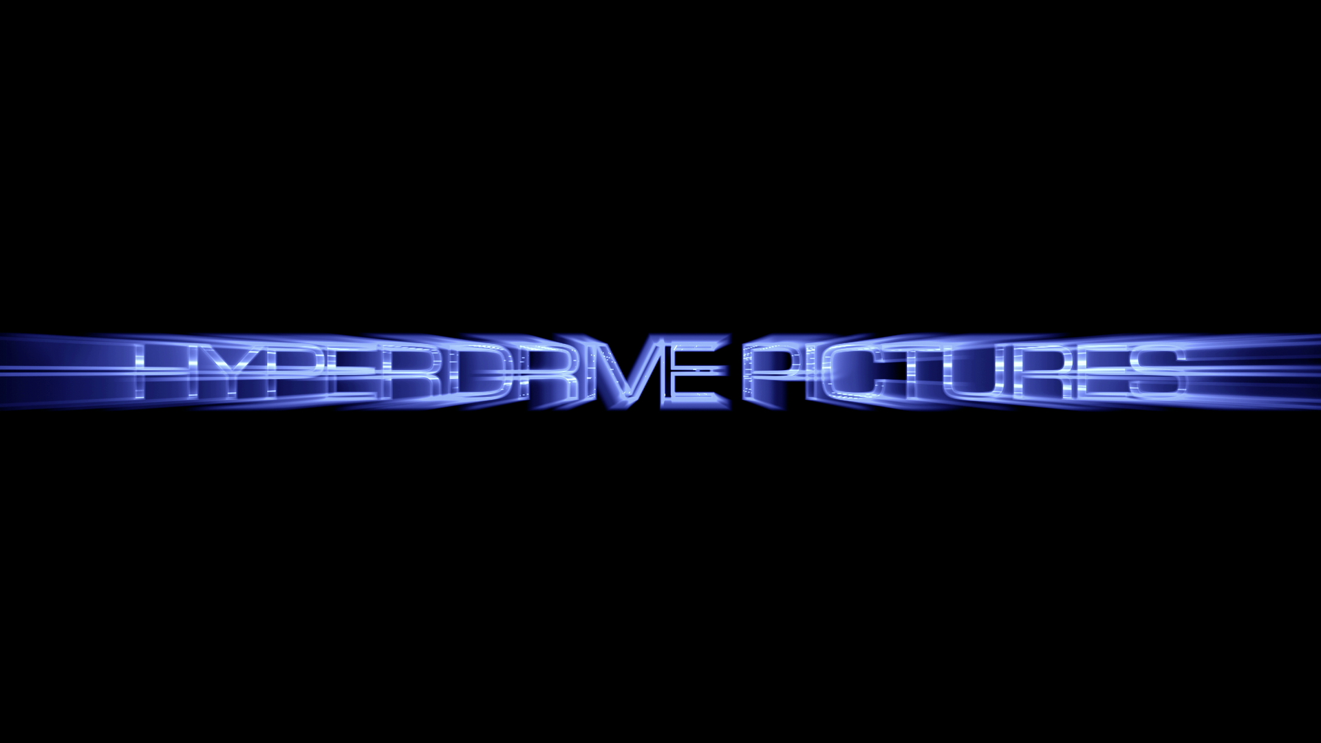
Flashforward to last week. With all the thought I've put into the new Youtube channel I'm developing with some friends, I've once again got a crystal clear image of what my new logo should look like. And I've been improving some cool techniques I could use to do it. So once again I sit down one afternoon and hammer out a new graphic I will proudly put at the beginning of my work! I finished, tweaked, and perfected it all in one short sitting again, too! I won't show it to you now, though. Just this screenshot.
The first time you should see it is at the beginning or end of one of my projects. You'll be able to see it on my new Youtube channel, HyperdrivePics. There's obviously nothing there yet since we're still in development, but if you go ahead and subscribe to it using your Youtube account, you'll know when our first project is online, the second we upload it! And you'll get to see the new logo for yourself, too!
One last funny thing. Though I strongly believe the new logo is superior in every way, isn't it interesting how I used the same color scheme, and the text streak effect is still present, albeit different? Guess that's a personal style thing that took me 'till now to realize.
![]()

Reader Comments